MIRAKL BRAND PLATFORMGUIDELINES / 2026
One intelligent system
for intelligent
commerce
Our brand mission is to add clarity to complexity.
Scroll to explore ↓
Our brand mission is to add clarity to complexity.
Mirakl is:
That:
In a way that feels:
For:
Our logo is the clearest expression of who we are.
Simple, confident and instantly recognisable.
Primary logoShould be used in most cases.
Secondary logoShould be used when the primary logo shouldn't.

Badge logoShould be used for small profile pictures and avatars.
Give the logo room to stand on its own.
One Mirakl presence across every touchpoint.
Structure creates clarity.
Our grid brings order to complex information and guides attention.
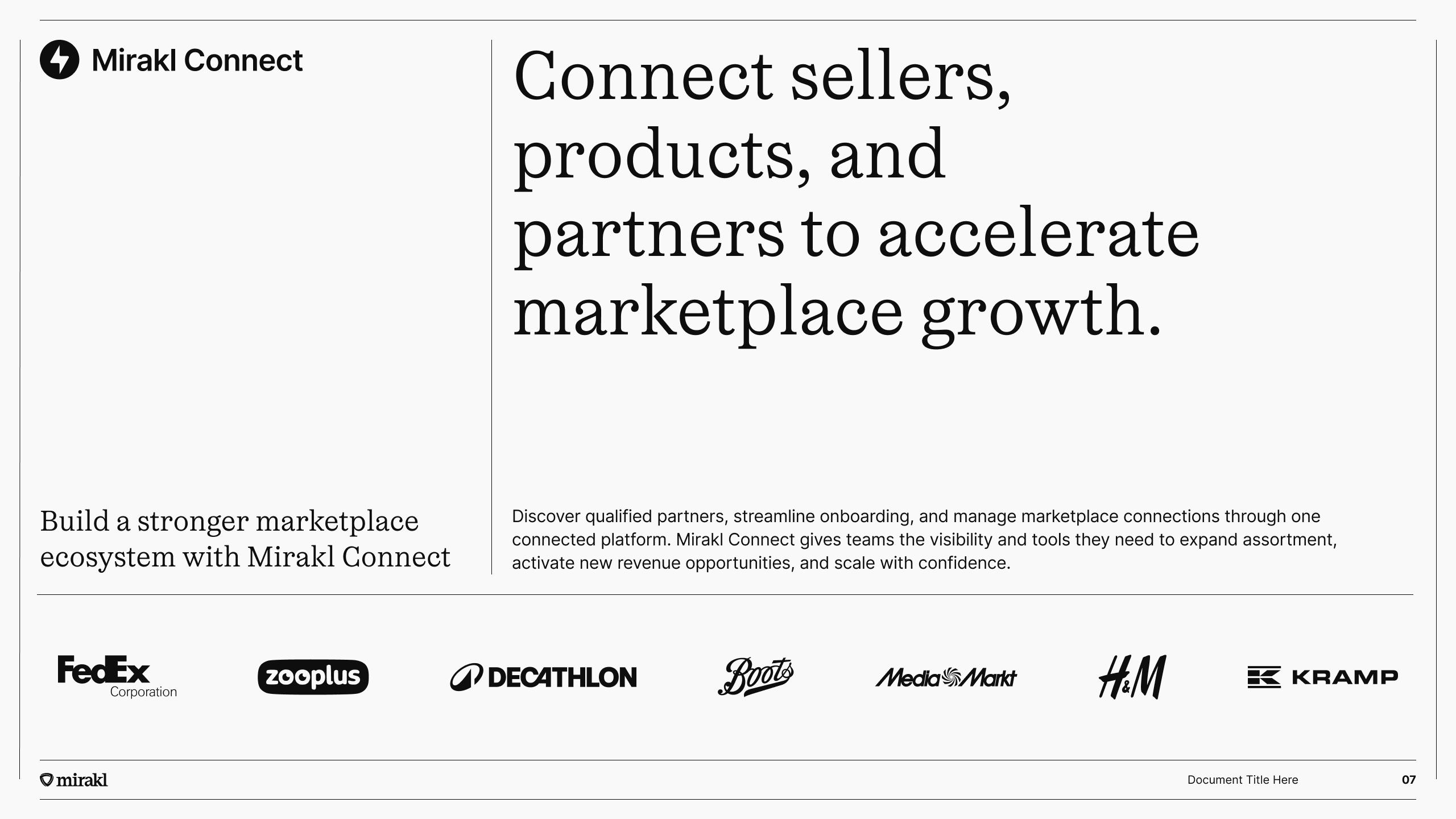
The distinctive gaps between our grid lines create an instantly recognisable Mirakl look.
Align content to the grid for structure, consistency and clarity in every layout.
Make every word count.
Typography gives our messages confidence and focus.
The operating system for intelligent commerce
Our display face. Use it for large headlines, statements and moments where the brand needs presence and character.
Our functional face. Use it for body copy, labels, navigation, captions and information-rich layouts.
Less noise. More clarity.
A predominantly monochrome palette lets content take centre stage.
Strips away unnecessary visual noise so content comes first.
Pops of Cobalt bring focus where it’s needed and guide attention.
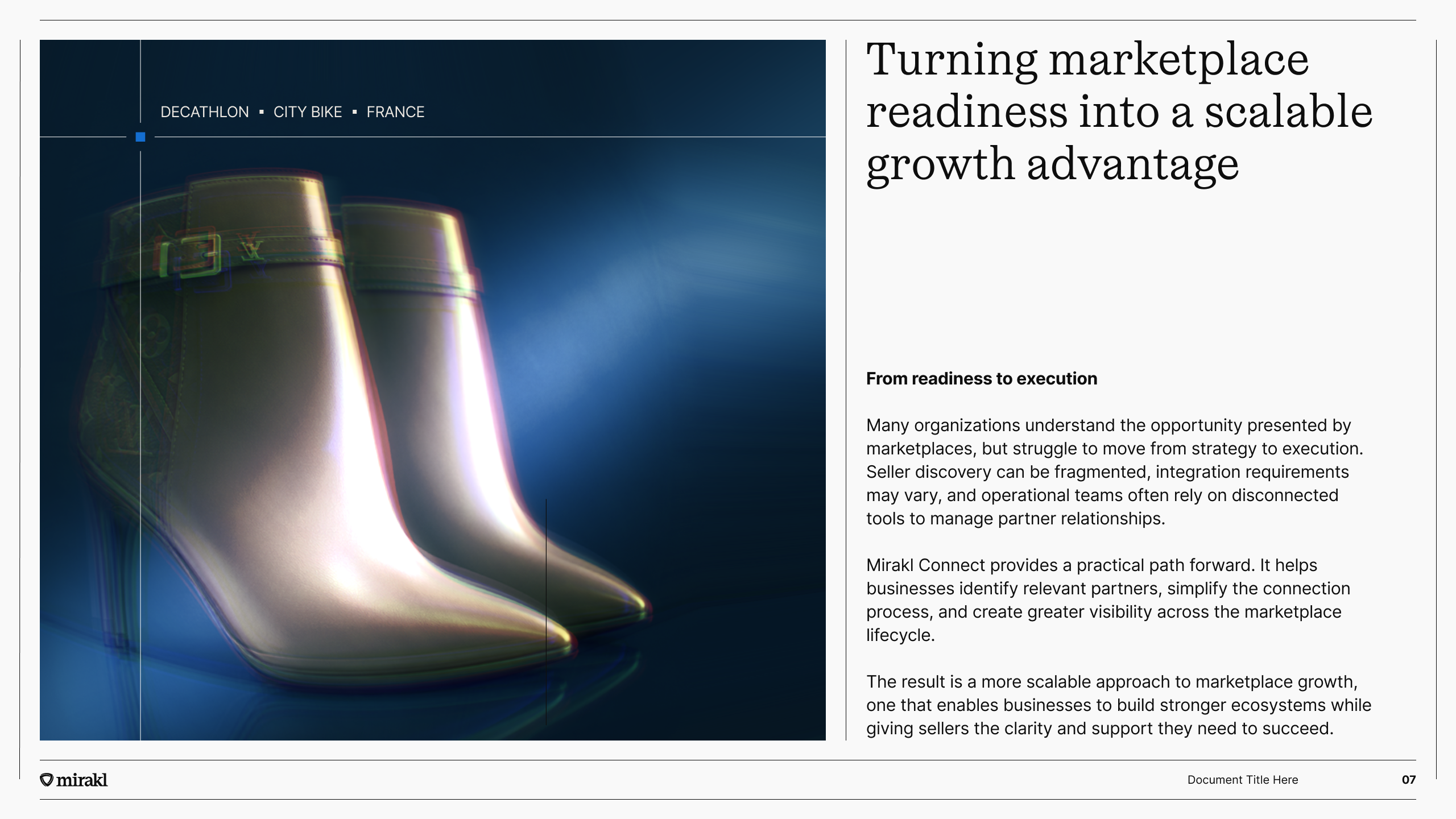
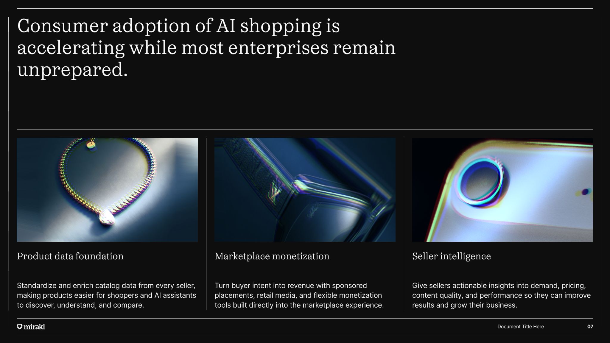
Photography brings the industries and products behind commerce into focus, from customer case studies to real-world applications.
The treatment creates focus while keeping the subject readable.
Our signature treatment dissects each subject, revealing new perspectives.
Tell customer stories, showcase industries and connect our technology to the real world.
Expressing the possibilities of commerce.
Rayonnement brings energy and movement to our identity.
Set headlines and statements directly on the animation.
Layer images, photography or illustrations over it.
Use for abstract concepts, technical processes or relationships that photography can’t show.
The library scales through a shared behavioural vocabulary. Geometry is selected for what it communicates — not simply how it looks.
Forms build vertically in layers or levels.
Use for the business themesScale · Growth · Progress · Maturity · FoundationForms radiate, widen or grow outward.
Use for the business themesExpansion · Reach · Opportunity · Growth · ScaleForms change incrementally from one state to another.
Use for the business themesProgress · Advancement · Evolution · Maturity · AccelerationForms move through a continuous sequence or direction.
Use for the business themesFlow · Momentum · Movement · Journey · Commerce · PaymentsOne visual language, selected by meaning.
Make the insight obvious.
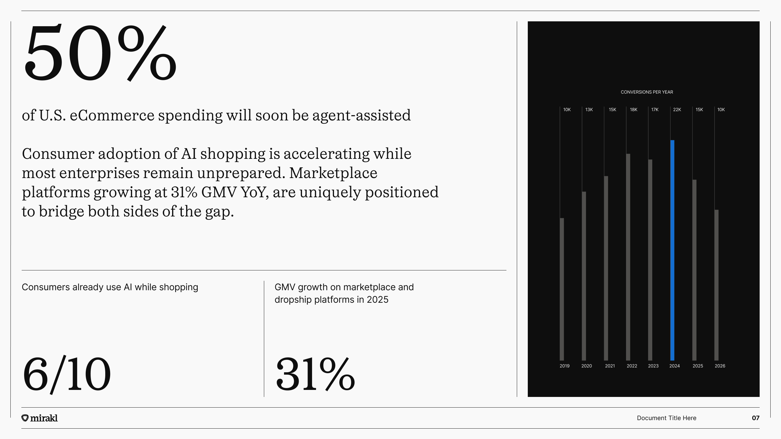
Data helps us tell the story of commerce in a way that’s easy to understand.
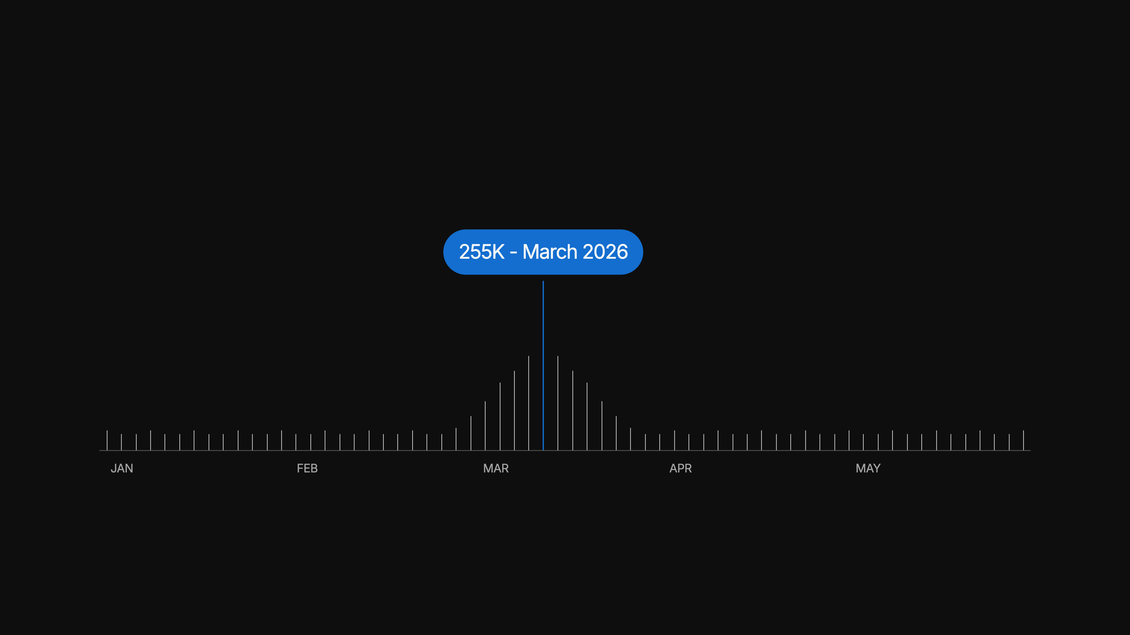
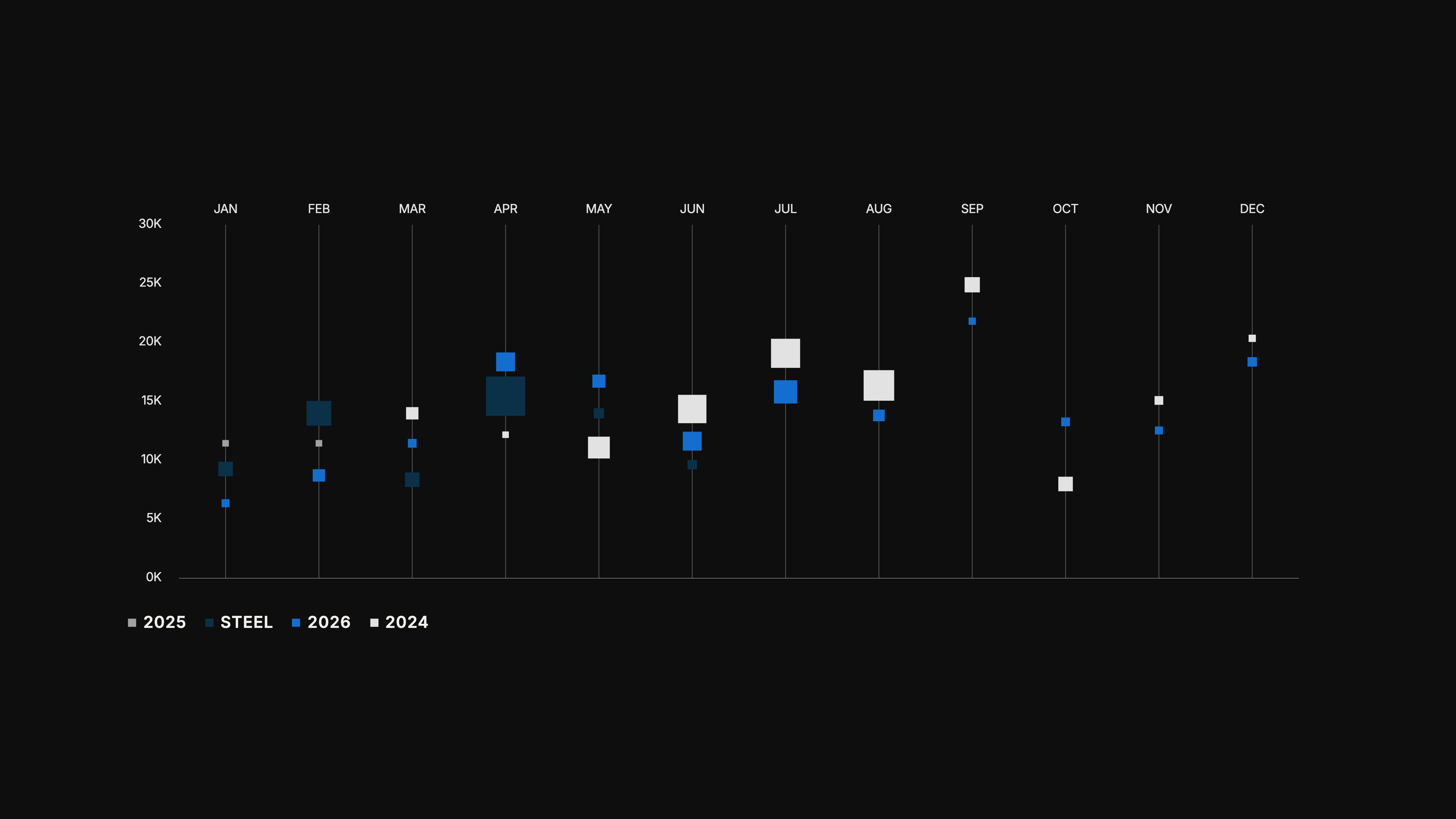
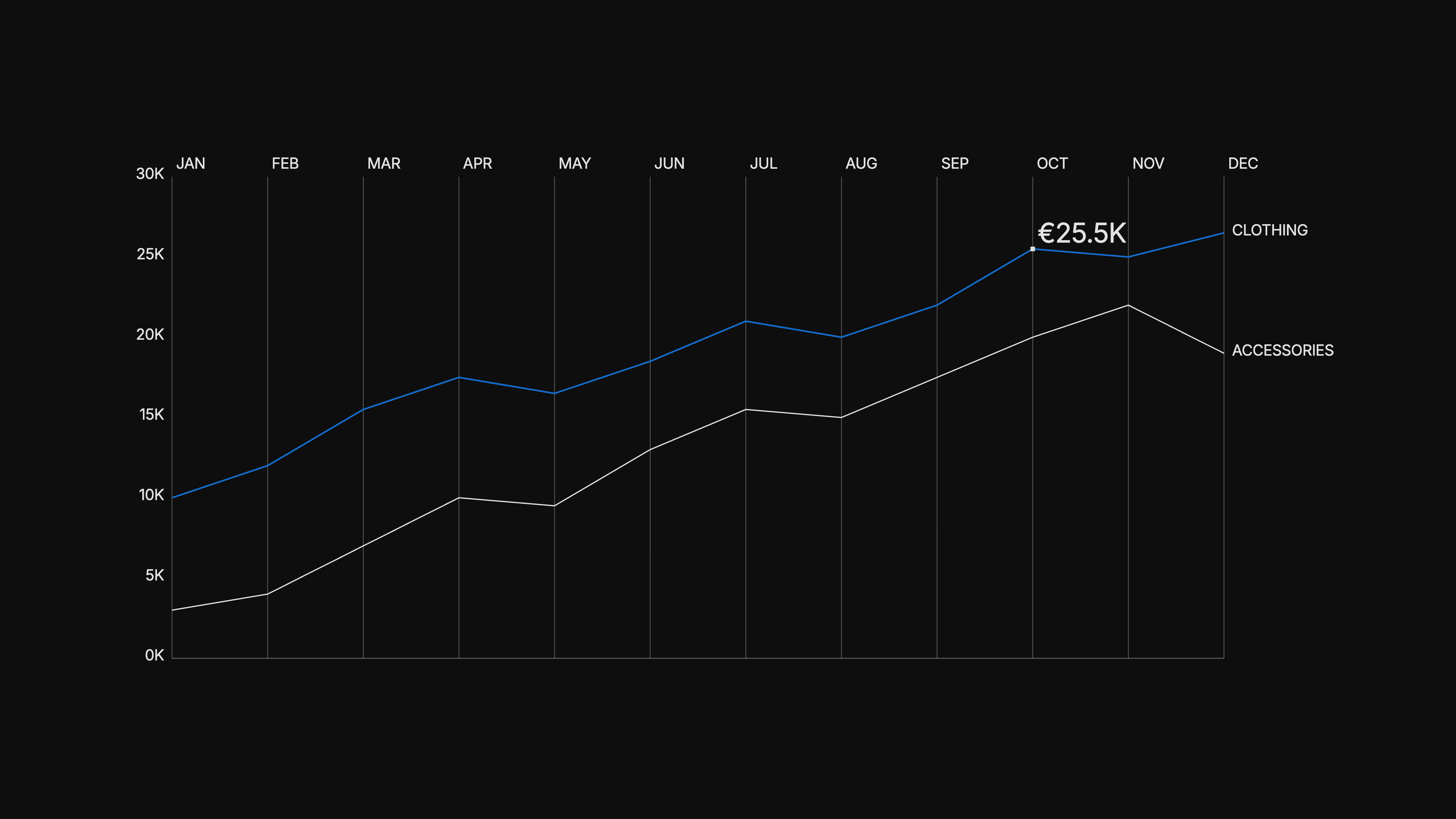
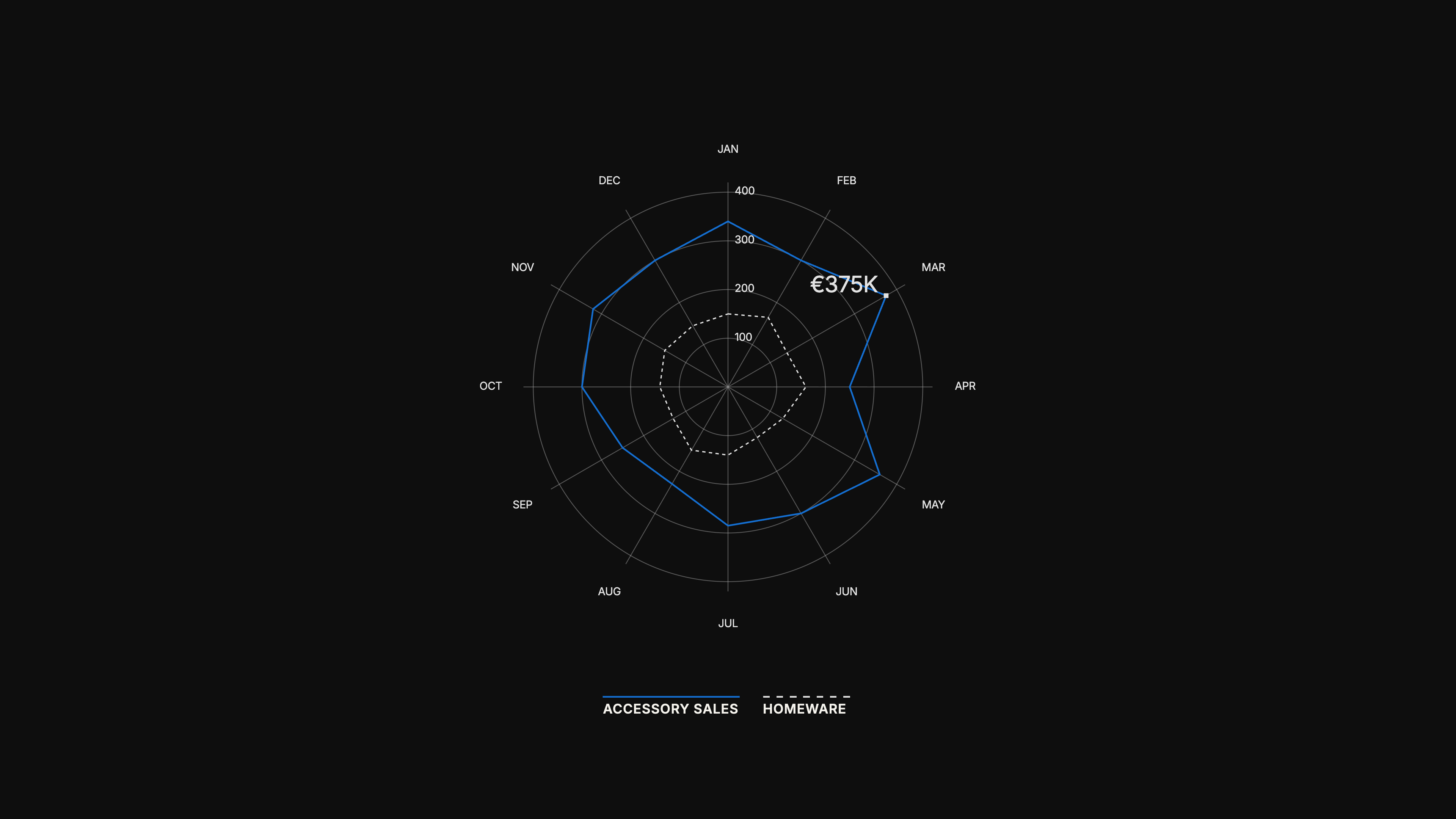
Use clear, simple visualisations to show performance, compare results and reveal insights.
Remove unnecessary detail and use colour to draw attention to what matters.
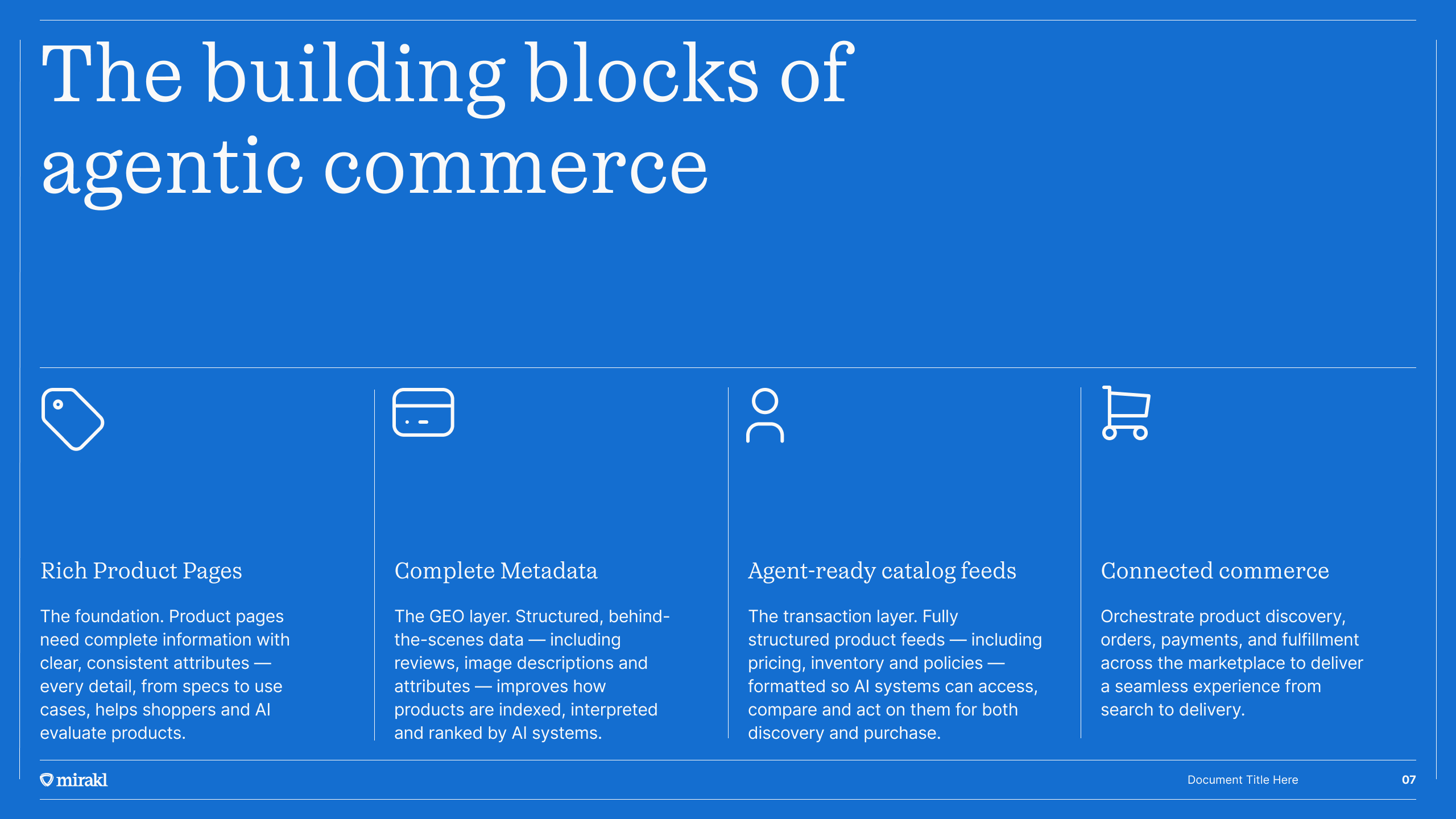
Small symbols. Clear meaning.
Our icons make information easier to recognise, navigate and understand.
Simple, consistent icons communicate actions and familiar concepts at a glance.
Use them to support clarity, never simply as decoration.